이 페이지에서는 컴포저블의 수명 주기에 관해 알아보며 Compose에서 컴포저블에 재구성이 필요한지를 결정하는 방법을 살펴봅니다.
수명 주기 개요
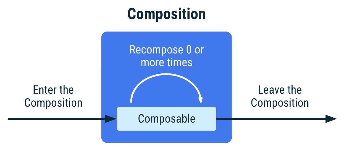
상태 관리 문서에 설명된 대로 컴포지션은 앱의 UI를 설명하고 컴포저블을 실행하여 생성됩니다. 컴포지션은 UI를 기술하는 컴포저블의 트리 구조입니다.
Jetpack Compose는 초기 컴포지션 시 처음으로 컴포저블을 실행할 때 컴포지션에서 UI를 기술하기 위해 호출하는 컴포저블을 추적합니다. 그런 다음 앱 상태가 변경되면 Jetpack Compose는 리컴포지션을 예약합니다. 리컴포지션은 Jetpack Compose가 상태 변경사항에 따라 변경될 수 있는 컴포저블을 다시 실행한 다음 변경사항을 반영하도록 컴포지션을 업데이트하는 것입니다.
컴포지션은 초기 컴포지션을 통해서만 생성되고 리컴포지션을 통해서만 업데이트될 수 있습니다. 컴포지션을 수정하는 유일한 방법은 리컴포지션을 통하는 것입니다.
리컴포지션은 일반적으로 State<T> 객체가 변경되면 트리거됩니다. Compose는 이러한 객체를 추적하고 컴포지션에서 특정 State<T>를 읽는 모든 컴포저블 및 호출하는 컴포저블 중 건너뛸 수 없는 모든 컴포저블을 실행합니다.
컴포저블이 여러 번 호출되면 컴포지션에 여러 인스턴스가 배치됩니다. 컴퍼지션의 각 호출에는 자체 수명 주기가 있습니다.
MyComposable의 표현 컴포저블이 여러 번 호출되면 컴포지션에 여러 인스턴스가 배치됩니다. 색상이 다른 요소는 요소가 별도의 인스턴스임을 나타냅니다.컴포지션 내 컴포저블의 분석
컴포지션 내 컴포저블의 인스턴스는 호출 사이트로 식별됩니다. Compose 컴파일러는 각 호출 사이트를 고유한 것으로 간주합니다. 여러 호출 사이트에서 컴포저블을 호출하면 컴포지션에 컴포저블의 여러 인스턴스가 생성됩니다.
리컴포지션 시 컴포저블이 이전 컴포지션 시 호출한 것과 다른 컴포저블을 호출하는 경우 Compose는 호출되거나 호출되지 않은 컴포저블을 식별하며 두 컴포지션 모두에서 호출된 컴포저블의 경우 입력이 변경되지 않은 경우 재구성하지 않습니다.
부수 효과를 컴포저블과 연결하기 위해서는 리컴포지션마다 다시 시작하는 대신 완료할 수 있도록 ID를 유지하는 것이 중요합니다.
다음 예를 참고하세요.
위의 코드 스니펫에서 LoginScreen은 LoginError 컴포저블을 조건부로 호출하며 항상 LoginInput 컴포저블을 호출합니다. 각 호출에는 고유한 호출 사이트 및 컴파일러가 호출을 고유하게 식별하는 데 사용하는 소스 위치가 있습니다.
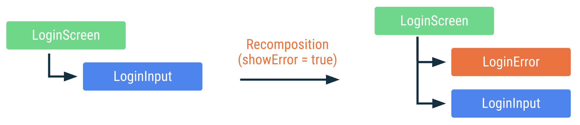
LoginScreen의 표현. 색상이 동일하면 재구성되지 않았음을 의미합니다.LoginInput이 첫 번째로 호출되었다가 두 번째로 호출되었지만 LoginInput 인스턴스는 여러 리컴포지션에 걸쳐 유지됩니다. 또한 LoginInput에는 리컴포지션 간에 변경된 매개변수가 없으므로 Compose가 LoginInput 호출을 건너뜁니다.
스마트 리컴포지션에 도움이 되는 정보 추가
컴포저블을 여러 번 호출하면 컴포저블이 컴포지션에도 여러 번 추가됩니다. 동일한 호출 사이트에서 컴포저블을 여러 번 호출하는 경우 Compose가 각 컴포저블 호출을 고유하게 식별할 수 있는 정보가 없으므로 인스턴스를 구분하기 위해 호출 사이트 외에 실행 순서가 사용됩니다. 이 동작만 필요한 경우도 있지만 경우에 따라 원치 않는 동작이 발생할 수도 있습니다.
위의 예에서 Compose는 호출 사이트 외에 실행 순서를 사용하여 컴포지션에서 인스턴스를 구분합니다. 새 movie가 목록의 하단에 추가된 경우 Compose는 인스턴스의 목록 내 위치가 변경되지 않았고 따라서 인스턴스의 movie 입력이 동일하므로 컴포지션에 이미 있는 인스턴스를 재사용할 수 있습니다.
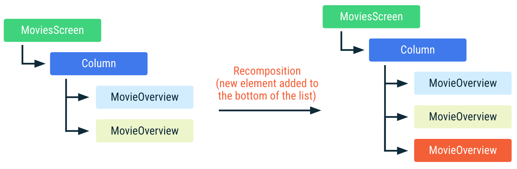
MoviesScreen의 표현 컴포지션의 MovieOverview 컴포저블은 재사용할 수 있습니다. MovieOverview의 색상이 동일하면 컴포저블이 재구성되지 않았음을 의미합니다.하지만 목록의 상단 또는 가운데에 항목을 추가하거나 항목을 삭제하거나 재정렬하여 movies 목록이 변경되면 목록에서 입력 매개변수의 위치가 변경된 모든 MovieOverview 호출에서 리컴포지션이 발생합니다. 이는 예를 들어 MovieOverview가 부수 효과를 사용하여 영화 이미지를 가져오는 경우 매우 중요합니다. 효과가 적용되는 동안 리컴포지션이 발생하면 효과가 취소되고 다시 시작됩니다.
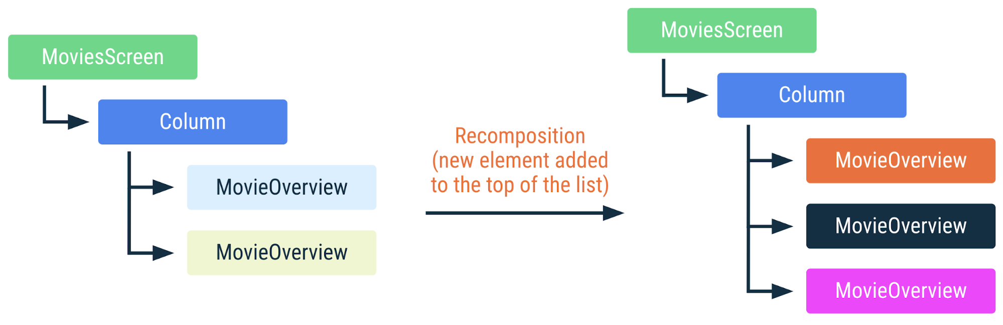
MoviesScreen의 표현 MovieOverview 컴포저블은 재사용할 수 없으며 모든 부수 효과가 다시 시작됩니다. MovieOverview의 색상이 다르면 컴포저블이 재구성되었음을 의미합니다.이상적으로 MovieOverview 인스턴스의 ID는 인스턴스에 전달된 movie의 ID에 연결된 것으로 간주됩니다. 영화 목록을 재정렬하는 경우 다른 영화 인스턴스로 각 MovieOverview 컴포저블을 재구성하는 대신 컴포지션 트리 내 인스턴스를 재정렬하는 것이 이상적입니다. Compose에서 런타임에 트리의 특정 부분(key 컴포저블)을 식별하는 데 사용할 값을 지정할 수 있습니다.
주요 컴포저블 호출로 코드 블록을 래핑하고 하나 이상의 값을 전달하면 이러한 값이 컴포지션에서 인스턴스를 식별하는 데 함께 사용됩니다. key 값은 전체적으로 고유하지 않아도 되며 호출 사이트에서의 컴포저블 호출 간에만 고유하면 됩니다. 따라서 이 예에서 각 movie에는 movies 사이에 고유한 key가 있어야 합니다. 앱의 다른 위치에 있는 다른 컴포저블과 이 key를 공유하는 것은 괜찮습니다.
위에서 목록의 요소가 변경되더라도 Compose는 개별 MovieOverview 호출을 인식하고 재사용할 수 있습니다.
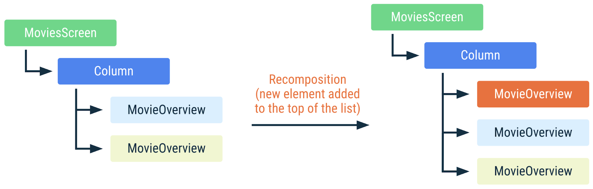
MoviesScreen의 표현 MovieOverview 컴포저블에는 고유 키가 있으므로 Compose가 변경되지 않은 MovieOverview 인스턴스를 인식하고 재사용할 수 있습니다. 인스턴스의 부수 효과는 계속 실행됩니다.일부 컴포저블에는 key 컴포저블 지원 기능이 내장되어 있습니다. 예를 들어 LazyColumn의 경우 items DSL에 맞춤 key를 지정할 수 있습니다.
입력이 변경되지 않은 경우 건너뛰기
리컴포지션 중에 입력이 이전 컴포지션에서 변경되지 않은 경우 일부 적격한 컴포저블 함수의 실행이 완전히 건너뛸 수 있습니다.
구성 가능한 함수는 다음의 경우를 제외하고 건너뛸 수 있습니다.
- 함수의 반환 유형이
Unit이 아님 - 함수에
@NonRestartableComposable또는@NonSkippableComposable주석이 달려 있습니다. - 필수 매개변수가 안정적이지 않은 유형임
마지막 요구사항을 완화하는 실험적 컴파일러 모드인 강력한 건너뛰기가 있습니다.
안정적인 유형으로 간주되려면 다음 계약을 준수해야 합니다.
- 두 인스턴스의
equals결과가 동일한 두 인스턴스의 경우 항상 동일합니다. - 유형의 공개 속성이 변경되면 컴포지션에 알림이 전송됩니다.
- 모든 공개 속성 유형도 안정적입니다.
@Stable 주석을 사용하여 안정적이라고 명시되지 않더라도 Compose 컴파일러가 안정적인 것으로 간주하며 이 계약에 포함되는 중요한 일반 유형이 있습니다.
- 모든 원시 값 유형:
Boolean,Int,Long,Float,Char등 - 문자열
- 모든 함수 유형 (람다)
이 유형은 모두 변경할 수 없으므로 stable 계약을 준수할 수 있습니다. 변경할 수 없는 유형은 절대 변경되지 않으므로 컴포지션에 변경사항을 알리지 않아도 되며 따라서 이 계약을 훨씬 더 쉽게 준수할 수 있습니다.
안정적이지만 변경할 수 있는 한 가지 중요한 유형은 Compose의 MutableState 유형입니다. 값이 MutableState로 유지되는 경우 State의 .value 속성이 변경되면 Compose에 알림이 전송되므로 상태 객체는 전체적으로 안정적인 것으로 간주됩니다.
컴포저블에 매개변수로 전달된 모든 유형이 안정적인 경우 UI 트리 내 컴포저블 위치를 기반으로 매개변수 값이 동일한지 비교합니다. 이전 호출 이후 모든 값이 변경되지 않은 경우 리컴포지션을 건너뜁니다.
Compose는 증명할 수 있는 경우에만 유형을 안정적인 것으로 간주합니다. 예를 들어 인터페이스는 일반적으로 안정적이지 않은 것으로 간주되며 구현을 변경할 수 없으며 변경할 수 있는 공개 속성이 있는 유형도 안정적이지 않습니다.
Compose가 유형이 안정적이라고 추론할 수 없지만 안정적인 것으로 간주하도록 하려면 @Stable 주석으로 표시하세요.
위의 코드 스니펫에서는 UiState가 인터페이스이므로 Compose가 일반적으로 이 유형을 안정적이지 않은 것으로 간주할 수 있습니다. @Stable 주석을 추가하면 Compose가 이 유형이 안정적임을 알게 되고 스마트 리컴포지션을 선호하게 됩니다. 즉 인터페이스가 매개변수 유형으로 사용되는 경우 Compose가 모든 구현을 안정적인 것으로 간주합니다.
참고자료